
Responsive Design, also known as
mobile design
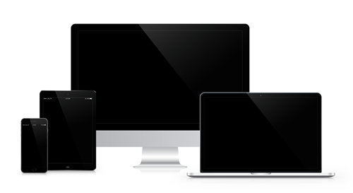
Responsive web design is a design approach that allows websites to adapt to different screen sizes and devices, providing an optimal viewing experience for users on desktops, tablets, and smartphones. Every website should be mobile-friendly. Over 55% of website traffic comes from mobile devices. 92.3% of internet users access the internet using a mobile phone or tablet.
Better user experience
With responsive web design, websites are optimized for the device being used, ensuring a seamless and intuitive user experience. This includes easy navigation, legible fonts, and appropriate image sizes, which all contribute to a positive user experience.
The website’s content and design are consistent across all devices. This makes it easier for users to navigate the website, find the information they need, and complete tasks.
Increased mobile traffic
With the increase in mobile browsing, having a responsive website is essential for reaching a wider audience. Responsive web design ensures that your website is accessible to mobile users.
Loading speed
Responsive websites are designed to load quickly on all devices, including mobile phones. This is important because mobile users are often on slower internet connections and may have limited data plans.
Improved search engine rankings
Google prioritizes mobile-friendly websites in its search results, and responsive web design is a key factor in determining mobile-friendliness. A responsive website can improve search engine rankings, leading to more traffic and visibility for your website.
Included with all of our websites
A responsive website eliminates the need to create a separate mobile website, which can be time-consuming and expensive. With responsive web design, you can create one website that works seamlessly across all devices, reducing development costs and maintenance.
With the ever-increasing range of screen sizes and devices available, responsive web design ensures that your website will remain relevant and accessible to users, regardless of the device they are using.
If your website is not mobile-friendly, please contact Grateful Web Services to change that!
